
In this blog Tony and John discuss the various types of risk reports and their relative merits for certain audiences. Operational Risk Software can be key to supporting this discipline.
Taken from: Mastering Risk Management
As we mentioned in our previous blog (What do all the numbers mean in risk reporting), different users have different needs and this is reflected in the different types of risk reports. The table below shows some of the different risk reports typically required by different categories of users. In addition, it shows the primary reports (which the user definitely requires) and the secondary reports (which the user may require for follow-up work).
The requirement of the board and the board risk committee is very straightforward and simply a dashboard showing the current position and a report showing the change in the risk profile from the previous period. This contrasts with the more complex requirements of the executive risk committee, the CRO and heads of business units and departments. All of the reports are, of course, used by the Risk Department and Audit although there are differing primary and secondary needs even between these two groups.
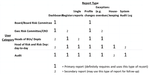
Board and the board risk committee
The fundamental needs of these two users is pulling together all the elements of data that are available, but in a succinct form. This is to enable the board and the board risk committee to take action on items which are outside risk appetite.
This need is satisfied by dashboards and risk profile changes. Dashboards show a number of linking data elements and the data is reinforced by profile changes.
Executive risk committee and CRO
The need of these two users is the same as the board plus an additional need to understand data at one further level down.
This is satisfied by the same reports as the board, i.e. dashboards and risk profile changes. However, there is a secondary need for the executive risk committee and CRO for reports on exceptions and overdue items.
Heads of business units and departments
These users have a need primarily for data elements relevant to their own particular areas plus the reports used by the higher levels of governance in order to take action before it is required by senior management or by the board.
These needs are satisfied by detailed registers, risk profile changes and exceptions as well as dashboards and single reports.
Head of risk and the risk management department on a day-to-day basis
Access to all reports is required although the primary need is to take action on detailed data elements and ensure the data are complete, accurate and verifiable.
This very complete need is satisfied by all reports being available.
Dashboards
It is important to draw together the threads of the various risk management processes so that a comprehensive and cohesive approach can be taken to managing risk. Such a report will show the major items of interest to the report user. A report giving a range of information, often in different formats to suit the particular topics being reported, is usually called a dashboard. This will combine a number of data elements to show an overall picture of the department, the business line or firm. Typically, this will include a selection of risks, controls, actions, indicators and events together with spidergrams, bar charts, line charts and commentary on the status of the department, business line or firm. This is useful for obtaining the linked overview of the state of risk management in the relevant area.
Below is an example of a dashboard. It provides a summary of risk information on the top risks of the firm including data on indicators and losses, as well as information on risk and control self-assessments. While there may be a loss of detail in any summary, salient information is brought out by different display formats. The summary table top left provides a good use of colour which draws attention to risks which require action, as well as providing a clear indication of indicator trends, which is developed in the bar chart at top right. The spidergram at bottom left is an effective way of highlighting relative levels of risks and controls. The column and line chart at the bottom right provides a clear visual summary of the detailed loss information just above it.
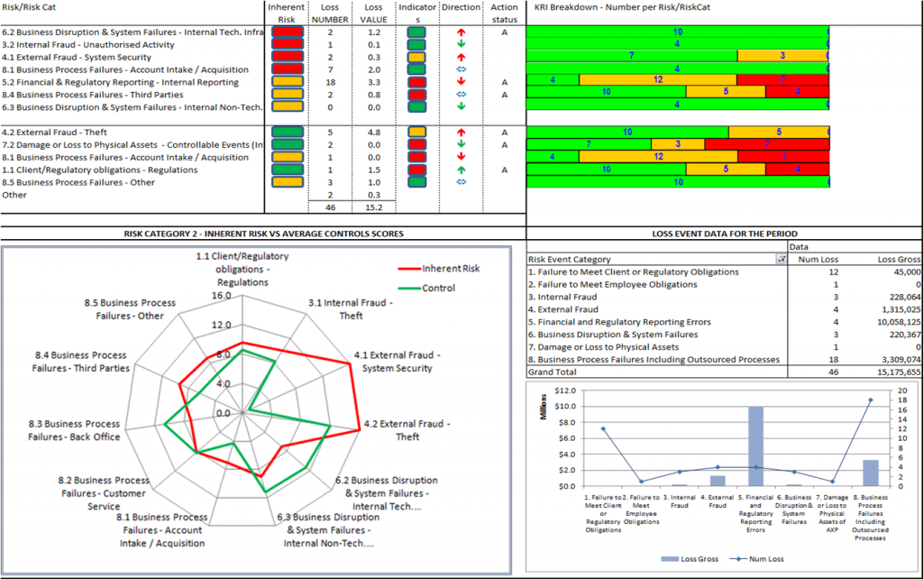
In addition, this report provides directional information in terms of arrows relating to the key risk indicators (KRIs). It is, however, important to remember that, for particular KRIs, down can be good or bad. So, arrows are often colour coded green or red to indicate whether the direction of travel is good or bad.
Registers
These give details on a particular element of risk management, for example, risks or events. They provide a useful drill down on the dashboards revealing all the data for a particular risk element. An example is shown below.
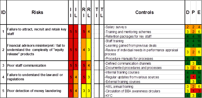
The risk register example gives details of five risk assessments and their control assessments. While risk 1 does not appear to be very well controlled, risk 2 has a better set of controls and the firm may be exposed to risk 3 as there are only two controls one of which is poor.
A register for losses is often a simple spreadsheet with columns for the loss event types and rows for the business lines. There are three other styles of register for events which give additional business value.
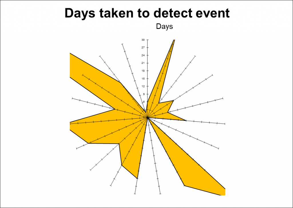
A register of events can show each event as a ‘spoke on a wheel’. The axis shows the number of days between the date that the event occurred and the date that it was detected. Almost all firms record three dates relating events: data of occurrence, date of detection and date of closure. The days taken to detect an event are a reflection of the quality of a firm’s detection controls. If a firm is poor in this area the loss may continue to grow until an event is detected as the corrective controls cannot start to have an effect.
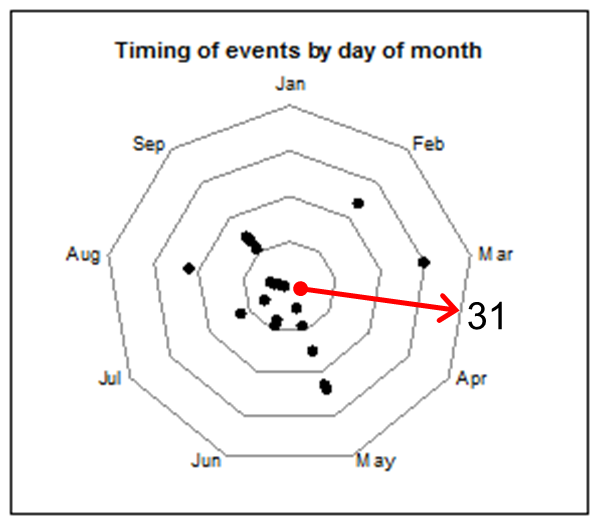
The register shown above records the date that the event occurred as a dot on the diagram, with the first of the month at the centre of the diagram and the 31st of the month at the outside. With this form of representation, it can easily be seen that the majority of events, over a nine-month period from January to September, occurred in the first two weeks of the month. The root cause of the event is therefore clearly linked to the beginning of the month (or quite possibly to the preparation of end-of-month reports for the previous month). An investigation into the resources of the department diverted into end-of-month reports may swiftly reveal the root cause.
The register of events shown below again shows each event as a ‘spoke on a wheel’. The axis is again a number of days, but this time it is the number of days between the date when the event was detected and the date that it was closed, i.e. actions to repair or enhance the control were completed. This clearly shows the efficiency of the corrective controls.
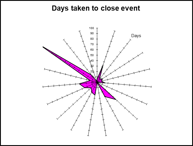
These example reports illustrate events showing that the corrective controls are quite efficient except for the control relating to the event at approximately 10 o’clock. These graphs display information in an alternative way to a simple spreadsheet with rows and columns. They also show that alternative representations for events registers are much better able to raise obvious questions that might not have been spotted in the more traditional format.
Single item report
This provides very detailed data on a particular item of a particular data element, for example, the data associated with a particular risk. This enables that item to be easily challenged by reference to all the other information relating to it. Unsurprisingly, such a detailed report is typically used by the Head of Risk and the risk department on a day-to-day basis (and of course by Audit).
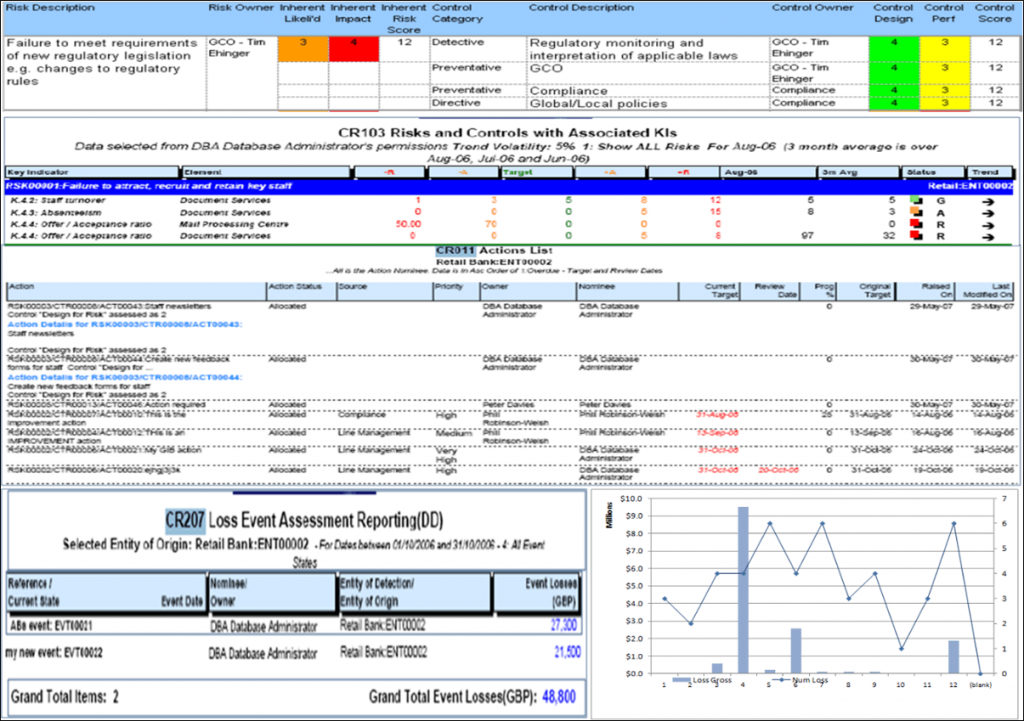
Here is an example of a typical single item report. Although the risk shown is inherently quite high, the controls are reasonably strong. So without the additional information, the firm may be relaxed about this risk. However, of the four KRIs, two are red and one is amber. Clearly there are a number of actions underway although there are also two losses. The status of the risk and control self-assessment should therefore be challenged (or continue to be challenged) by the risk management department.
This provides data on the changes to an element of risk management. It enables the progress of an element to be tracked. These are often combined with data related to the current period. An example of a KRI profile change is shown below.
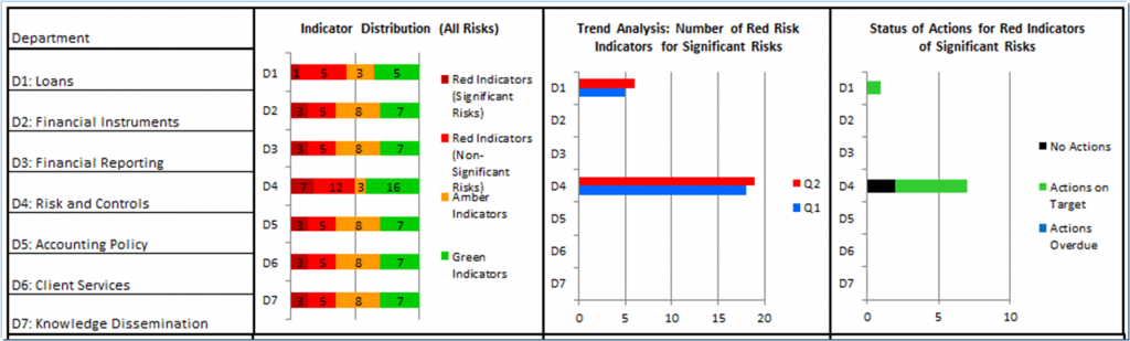
The profile change example gives context in the top two boxes for the profile change in the trend analysis box. Further information is given in the right-hand bottom box leading to the conclusion that the KRIs in department D4 have increased in the second quarter and that there are two KRIs with overdue actions.
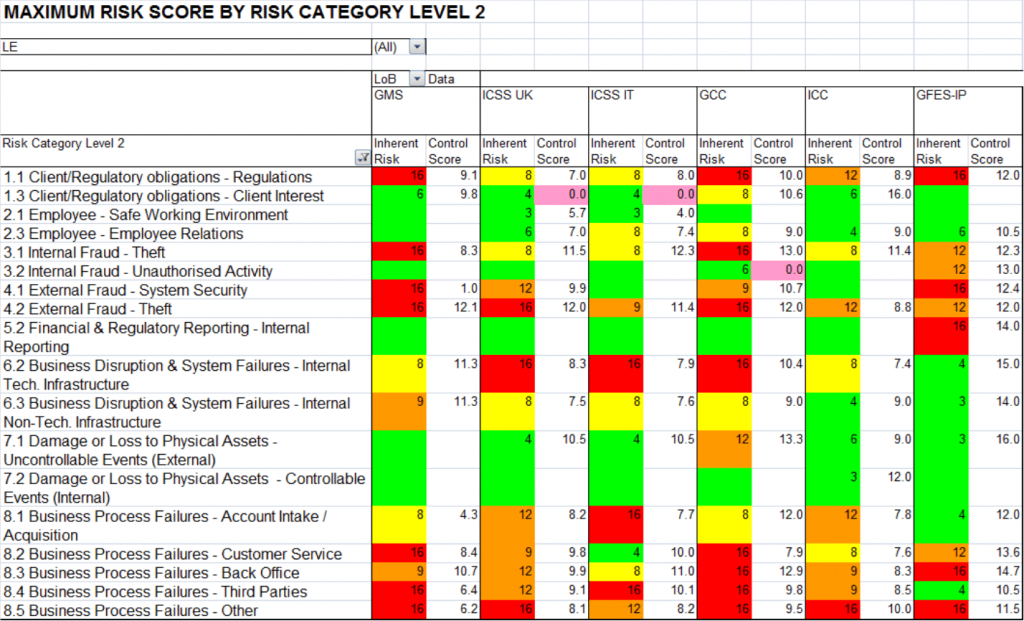
Exceptions report
This provides identification of exceptions to data elements, for example, overdue actions. It is also useful in identifying limit breaches to be actioned. The exceptions report below shows the maximum risk score by level 2 risk category. On investigation it can be seen that there are widely different states in different risk categories. For example, Category 2.1
Employee – safe working environment is entirely green and is to be expected. Anything other than green for this category would require immediate action.
However, there are several categories that are largely red. For example, Categories 4.2 External fraud – theft and 8.5 Business process failures – other require focus by the relevant category owners and challenge and monitoring by the risk management department. It is undoubted that such a report would raise questions from management and senior management.
Summary
Good reports are essential to good risk management. Key information must be easily accessible and delivered in such a way as to support information business decisions on the firm’s risk profile. That sounds easy and obvious, but is not so easy in practice. It is only too easy to be overwhelmed by information which is not focused on readers’ needs. That can include too much information, information which is not relevant to the reader and information which may be relevant, but is not presented in a way which is readily understandable. With risk, readers can be at every level of the firm, so the range is wide.
That’s it for Reporting, in our next series of blogs Tony and John discuss the practical business side to risk management, and what keeps management awake at night. We will be starting with Independent Assurance.
Mastering Risk Management by Tony Blunden and John Thirlwell is published by FT International. Order your copy here: https://www.pearson.com/en-gb/subject-catalog/p/mastering-risk-management/P200000003761/9781292331317
For more information about how Operational Risk software can help your organisation, contact us today on sales@risklogix-solutions.com